Stonbirth: A Handwritten Script Font for Digital Charm
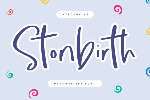
As a UI designer who ships landing pages, SaaS dashboards, and e-commerce experiences, I don’t reach for script fonts lightly. They’re high-risk, high-reward — either they humanize your interface or they sabotage scannability. That’s why Stonbirth stands out in the Script Amp category: it’s a handwritten font with authentic rhythm, not just decorative flair. Its uneven baseline, subtle ink texture, and organic stroke contrast give it warmth without sacrificing digital legibility — especially at larger sizes.
Stonbirth isn’t built for body copy or navigation menus. It’s a display font, purpose-built for moments where personality must land instantly: hero section headlines, CTA buttons on conversion-focused layouts, brand taglines in digital ads, or quote overlays on portfolio site banners. Unlike overly ornate script fonts, Stonbirth avoids excessive ligatures or exaggerated flourishes — making it far more reliable on mobile viewports and responsive hero sections. On a 320px screen, a 48px Stonbirth headline remains distinct, readable, and tonally consistent — provided you keep it to three words max and pair it with generous letter-spacing.
For brand identity work, Stonbirth supports tone *without* compromising professionalism. A boutique online store selling handmade ceramics? Use Stonbirth for “Hand-Thrown Since 2019” above the fold — then switch to a clean sans serif like Inter or Manrope for product cards and pricing. A wellness coach launching a course? Try Stonbirth for the headline “Your Calm Starts Here”, layered over a soft gradient background. The font’s slight irregularity signals approachability and authenticity — traits users increasingly associate with trustworthy digital brands.
Readability hinges on context — and Stonbirth shines when used intentionally. On light backgrounds, it reads cleanly at 36px+. On dark mode interfaces or image overlays, increase contrast by applying a subtle white stroke (1px) or using CSS text-shadow for separation. Avoid thin weights or ultra-light variants for small CTAs; instead, reserve Stonbirth for buttons labeled “Join the Circle” or “Get Your Guide” — short, action-oriented phrases that benefit from expressive typography. Never use it for form labels, error messages, or tab navigation.
Font pairing is where Stonbirth earns its place in serious web design workflows. Pair it with a neutral, highly legible sans serif for all functional text: headings, paragraphs, captions, and interface labels. For editorial-style blogs or creative agency sites, consider a warm serif like Cormorant Garamond for long-form content — letting Stonbirth anchor section intros and pull quotes. Its natural contrast creates visual hierarchy without relying solely on size or color. In a product landing page, for example, Stonbirth sets the emotional hook (“Made With Care”), while your body font delivers clarity and credibility.
Stonbirth ships as a modern webfont package — typically including WOFF2 files for optimal loading, OpenType features like stylistic alternates, and basic multilingual support covering Latin-based languages (English, Spanish, French, German, etc.). Check the vendor specs before purchase: some versions include uppercase-only glyphs, while others offer lowercase and punctuation optimized for digital display. If your project targets global audiences or requires diacritics, verify coverage early. Also confirm whether the license permits self-hosting on client websites, Shopify themes, or SaaS platforms — most premium fonts sold through Script Amp allow this, but always review the commercial font license terms for web embedding, template resale, and digital asset usage.
In practice, I’ve used Stonbirth across several real-world projects: a wedding planner’s portfolio site (hero headline + testimonial accents), a sustainable skincare brand’s email campaign headers (paired with Lato for body), and a creative workshop’s course sales page (“Reserve Your Spot” button + section dividers). Each time, the font elevated perceived value without slowing down performance — thanks to lightweight file sizes and smart fallback strategies.
It’s also effective in micro-interactions: animated hover states on Stonbirth-labeled buttons feel tactile and intentional, especially when paired with smooth transitions and restrained easing. Just avoid animating the font itself (e.g., letter-by-letter reveals) — it can distract from usability goals. Instead, animate background color or scale the container, keeping the type stable and legible.
One practical note: always test Stonbirth across devices *before* finalizing a layout. Its charm lives in its imperfection — but that same quality can blur on low-DPI screens or older Android browsers. If you notice inconsistent rendering, add font-smooth: always or -webkit-font-smoothing: antialiased in your CSS reset. And never rely on system fallbacks — define a clear stack: font-family: "Stonbirth", "Inter", -apple-system, BlinkMacSystemFont, sans-serif;
Finally, remember that great typography serves the user first. Stonbirth works because it’s expressive *and* controlled — a rare balance in the handwritten font space. It supports brand storytelling without obscuring information, adds visual interest without breaking rhythm, and helps digital products feel less transactional and more human. Whether you're designing a one-page app, a Shopify theme, or a branded Notion workspace, Stonbirth gives you a tool to signal care, craft, and intention — right down to the curve of a lowercase “g”.